


Overview of Blog Entries for Diagrams in OriginPro and Origin 2021b
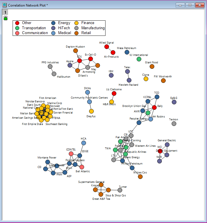
Network Plot in OriginPro and Origin 2021b
In OriginPro and Origin 2021b OriginLab introduced Network plot (Menu Plot:Categorial:Network). It shows the interconnection between a set of entities. Each entity is represented as a node while connecitons between entities are represented by links between nodes. Users can manually drag nodes around.
Read more at the OriginLab Blog
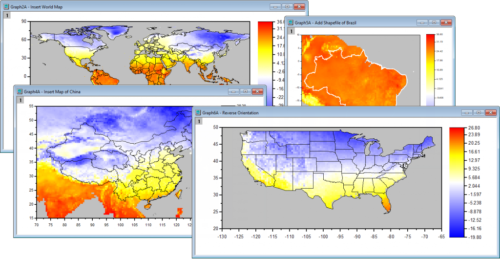
Adding Maps to Graphs with Built-In and Imported Shapefiles
Origin has had support for adding maps to graphs for many versions via the Google Maps App. Origin also supported using shapefiles in older versions of Origin, though the process was somewhat difficult. With Origin 2021b, support for using shapefiles has been made remarkably easy.

Read more at the OriginLab Blog
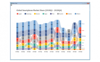
Ribbon and 100% Ribbon Chart
In OriginPro and Origin 2021b, ribbon and 100% ribbon charts were introduced, which can be accessed via the menu "Plot > Categorial". It is a stacked column chart with color filled between bars. In stacked column charts, values are shown in the same order in each stack, while in Ribbon charts bars in each stack are sorted.
The blog post gives some examples of when to use ribbon charts and shows the available customization options.

Read more at the OriginLab Blog
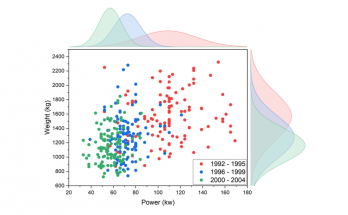
Grouped Marginal Plot
Grouped marginal plots were introduced with OriginPro and Origin 2021b and can be found in the menu "Plot > Statistical > Grouped Marginal Plot". With grouped marginal plots, multiple groups of XY data can be examined in one graph.
The blog post discussed several use cases and shows some of the customizations of this diagram type.
