


Conditional Formatting in Origin 2019
Excel has a very useful and fancy way to visualize data directly on the spreadsheet called "conditional formatting". This feature now is also available in Origin 2019 with three options:
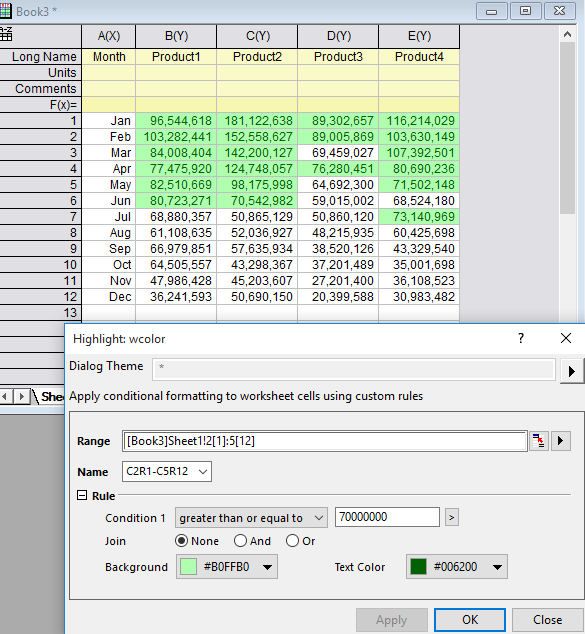
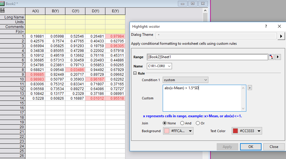
- Highlight: Color cells that meet the condition
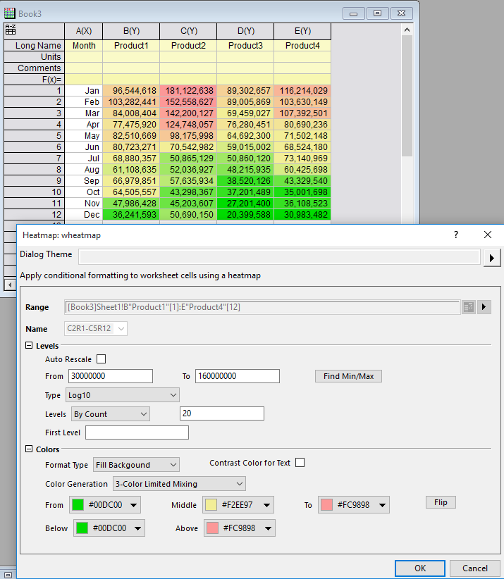
- Heatmap: Color cells by values using a palette or a color list
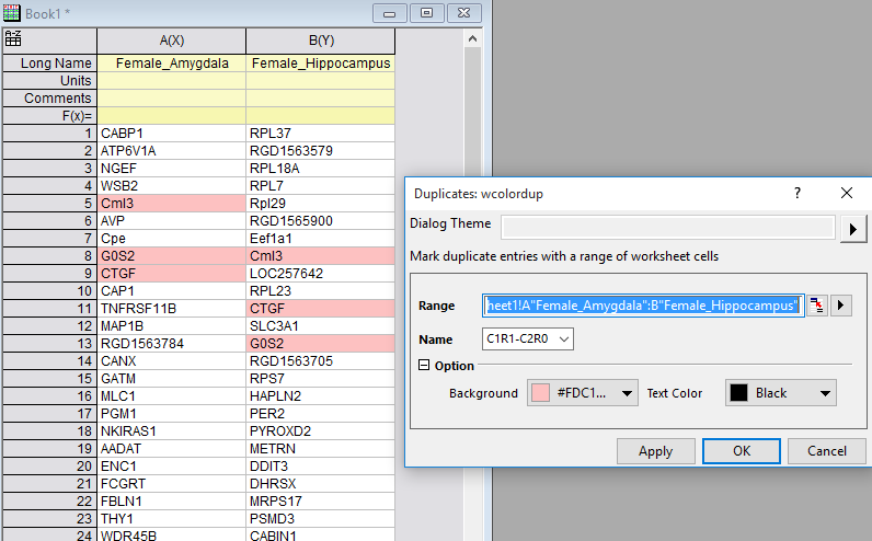
- Duplicates: Color cells with duplicate values
The idea of conditional formatting is to easily identify the key pieces from large datasets, by applying special formatting to cells in the spreadsheet that meet certain criteria. It visually calls the user's attention to important data points like outliers or a certain event.
Examples
Highlight with built-in ConditionHighlight values greater than a specified value |
Highlight with User-defined ConditionHere is a block of measurement data and outliers, that are outside 1.5 * StdDev, are highlighted |
 |
 |
Highlight DuplicatesGene profiles from two different samples are cross compared to see if there will be matching pairs. |
HeatmapVisualize this sales data by cell values in worksheet — The sales usually start high at the beginning of the year and keep going down |
 |
 |