


Overview of Blog Entries for Diagrams in Origin 2019b in OriginPro und Origin 2020
Pie and Doughnut Charts in Origin 2020 in OriginPro and Origin 2020
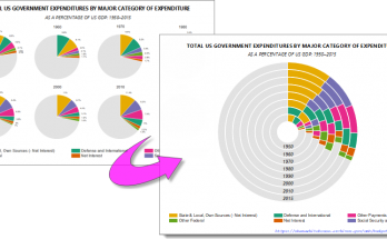
Pie or Doughnuts??
Pie charts are one of the most common and easily understood graph types. They are used to plot relative percentages among categories of a given variable. The circular “pie” is the whole — the total value of all categories — and each category is a “slice” whose percentage of that whole is proportional to the length of its projected arc.
Doughnut charts (aka “Donut” charts) are an extension of pie charts. The doughnut chart allows the presenter to combine the information of multiple “pies” into a single graphic, thus producing gains in both economy of space and of ease with which the viewer can spot trends over time. On the other hand, multiple pie charts may be preferable when the presenter needs to draw attention to relative proportions, as the ring structure of the doughnut chart emphasizes the outer plots and de-emphasizes the inner plots.
Read more at the OriginLab Blog
Sankey Diagrams in OriginPro and Origin 2020
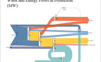
Sankey diagrams are useful for depicting the distribution and fate of some commodity of interest (energy, money, human migration, etc.) throughout a given system. Flows are represented by bands of varying thickness. Thickness is proportional to the contribution of a given pathway, to the total flow.
Read more at the OriginLab Blog
Dendrograms in OriginPro 2020
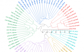
Dendrogram is a tree-structure diagram visualizing affiliation between objects. It is used in many fields.
- In hierarchical clustering, it illustrates how cluster is constructed from a large set of data based on Hierarchical Clustering Analysis.
- In computational biology, it works together with heatmap to display how the objects (usually genes) are clustered.
- In phylogenetics, it is also called “phylogenetic tree”. It represents the relationship among various species during evolution.
Read more at the OriginLab Blog
Kite Diagrams in OriginPro and Origin 2020
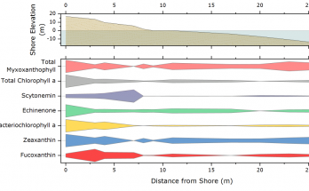
Kite Diagrams are most often used in biological and ecological studies to chart relative abundance of some species or quantity of interest, along a predetermined transect. At regular sampling points, the technician will collect a sample or make some observations and the resulting data from each sampling point are later compiled and plotted as a function of distance from the transect starting point. The resulting Kite Diagram gives a quick view of the qualitative effects of zonation on species, water chemistry, etc .
Read more at the OriginLab Blog
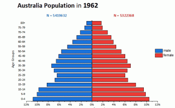
Pyramid Plots in OriginPro and Origin 2020
Pyramid plots (aka population pyramids) are used for plotting age and gender distributions within a given population. Making such graphs is much simplified for OriginPro and Origin 2020 (though possible in previous versions, creation required many steps).