


New in OriginPro 2020 und Origin 2020
OriginPro and Origin 2020 offer the following new features:
- Mini Toolbars for Quick and Easy Graph Customization
- 10x Faster Import of Large Text Files
- 5x Faster Scatter Plots for Large Data
- Plot millions of points in seconds with the new Density Dots plot
- Enhanced Database Import
- Other Speed Improvements
- Pie and Doughnut Charts
- Sankey and Alluvial Diagrams
- Dendrograms
- Other New Graph Types
- Copy and Paste Data Plot
- Copy and Paste HTML or EMF Tables
- Absolute Referencing in Cell Formula
- New Apps
- Other Features
Mini Toolbars for Quick and Easy Graph Customization
Edit and customize graph elements quickly using Mini Toolbars in OriginPro and Origin.
These toolbars are sensitive to the type of graph and object selected. The buttons in the pop-up provide access to common customization options, so you can perform quick changes to your graph without opening complex dialogs.
Customize group or individual data plots, axes scales and styles, font settings for all text on the page, layer properties, page properties and more, using these convenient pop-up toolbars. You can even copy a data plot from one graph and paste it to another graph!
10x Faster Import of Large Text Files
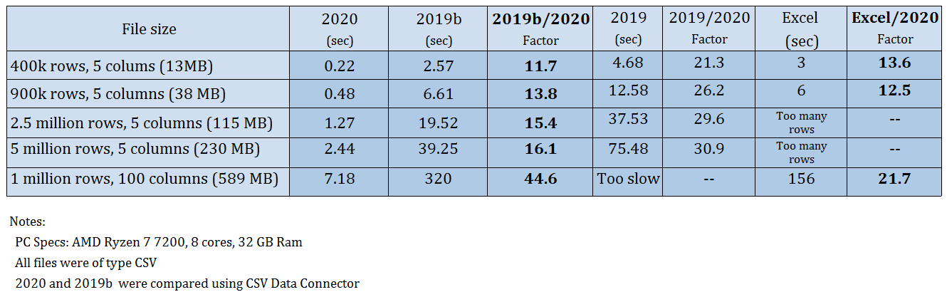
Benchmark for Faster Import of Large Text Files
Importing large text files has been significantly improved in the latest version of OriginPro and Origin.
Import speed has been improved by a factor of 10 or more as compared to previous versions of OriginPro and Orign. This was done by making full use of the processor's multi-core architecture.
Benchmark for Faster Import of Large Text Files
5x Faster Scatter Plots for Large Data
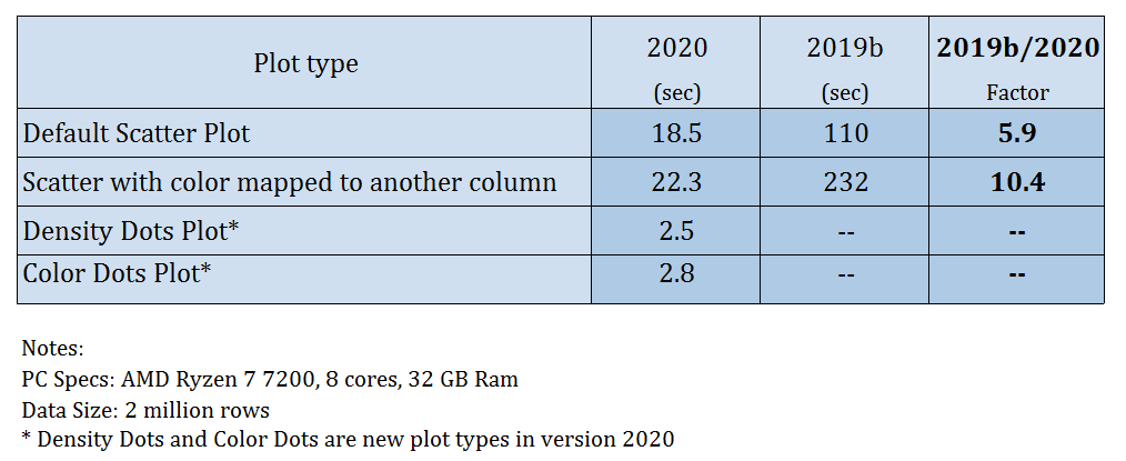
Benchmark for Scatter Plots for Large Data
Scatter plots of large datasets are drawn much faster in the new version of OriginPro and Origin. This includes the default XY scatter plot as well as colormapped scatter plots in which a third column is used to assign scatter point color.
In addition, this new version also introduces two new plot types which produce more significant gains in plotting speed:
- Density Dots Plot
- Color Dots Plot
View sections below for details on these new plot types.
Benchmark for Scatter Plots for Large Data
Plot millions of points in seconds with the new Density Dots plot
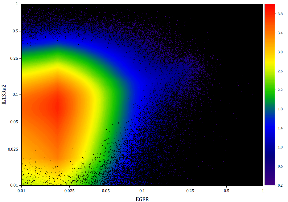
New Density Dots plot of 2 million data points. Colormap represents data density computed using a fast algorithm.
Density Dots is a new plot type introduced in OriginPro and Origin 2020 to create scatter plots from very large datasets on the order of millions of data points.
The data is presented as a scatter plot where the points are colormapped to the data density. The density is computed using a fast algorithm that utilizes 2D binned approximation and 2D interpolation.
Creating this plot from 2 million XY data points takes just 2 to 3 seconds! See table in section above.
New Density Dots plot of 2 million data points. Colormap represents data density computed using a fast algorithm.
Enhanced Database Import
Several enhancements have been made to database import in this version of OriginPro and Origin:
- Directly import images stored inside the database as pictures in worksheet cells
- Protect imported data from editing, to ensure data integrity
- Clear imported data when saving projects to reduce file size
- Improved Ease of Use and performance
More information at the OriginLab Blog
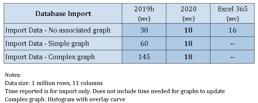
Benchmark for Database Import
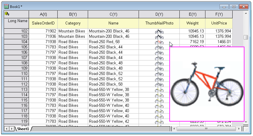
Worksheet with data imported from database including images. Hovering on cell with image will display larger image as pop up.
Other Speed Improvements
OriginPro and Origin 2020 offer performance enhancements in several other areas such as Peak Analysis, Worksheet Data Filters, Contour Plotting, Worksheet Operations, and Importing Third Party files.
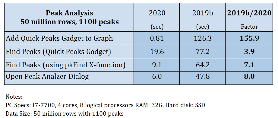
Benchmark for Peak Analysis
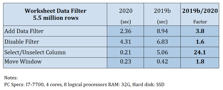
Benchmark for Worksheet Data Filters
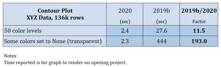
Benchmark for Contour Plotting
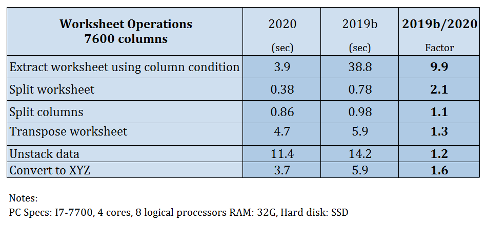
Benchmark for Worksheet Operations
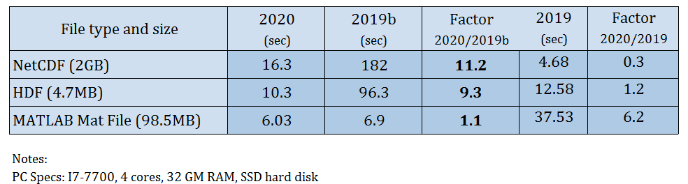
Benchmark for Importing Third Party files
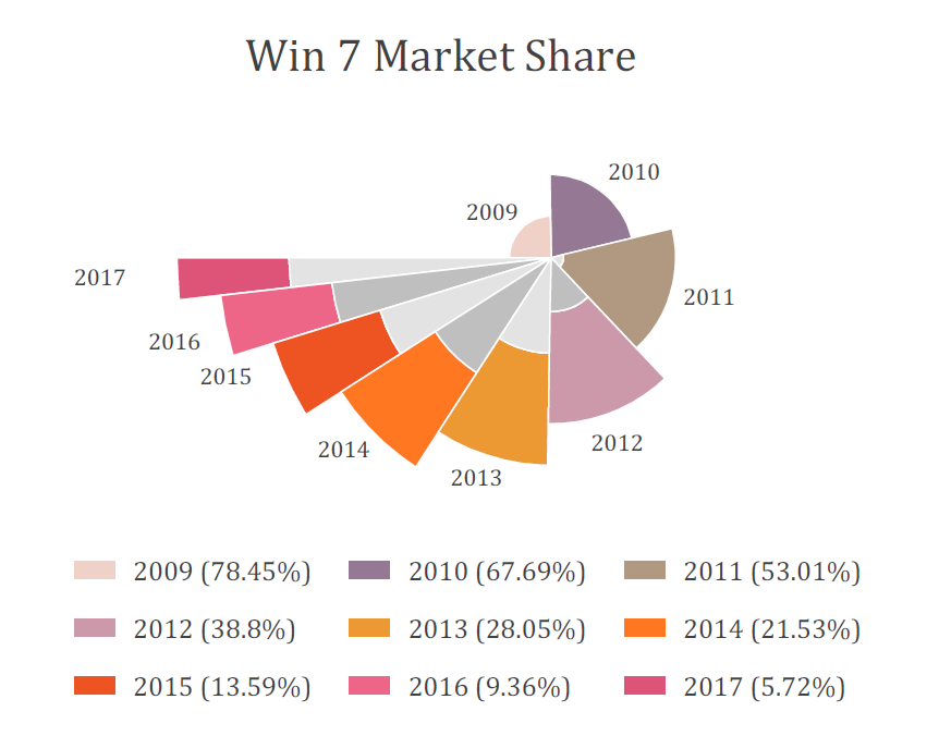
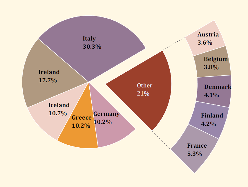
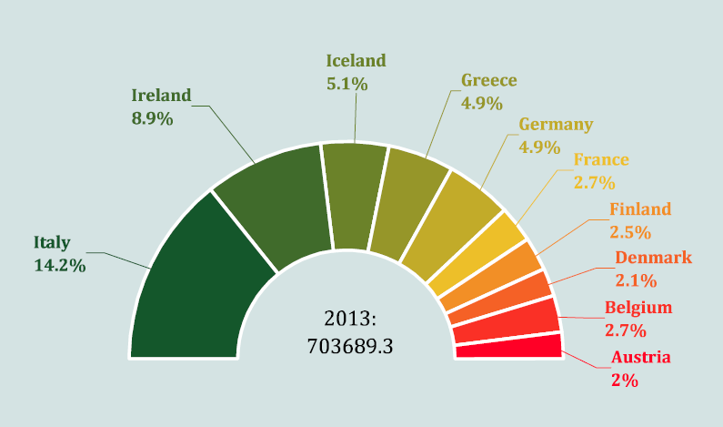
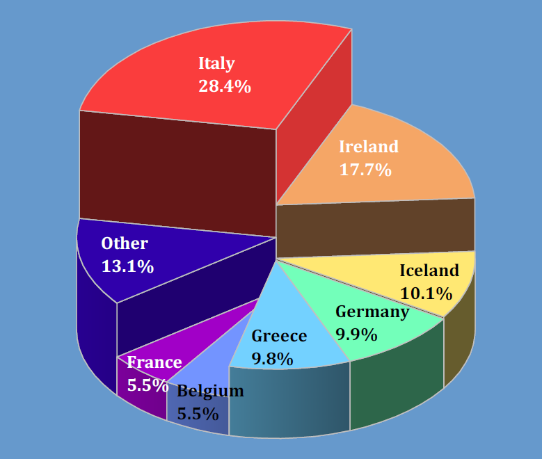
Pie and Doughnut Charts
Pie charts in OriginPro and Origin have been significantly revamped in this new version.
OriginLab has also introduced variations such as Doughnut plots with several customization options, and an improved 3D Pie chart.
More information at the OriginLab Blog
Sankey and Alluvial Diagrams
Two new plot types introduced in version 2020 of OriginPro and Origin:
- Sankey Diagrams
More information at the OriginLab Blog - Alluvial Diagrams
These plot types are extremely useful to visualize the flow of data.
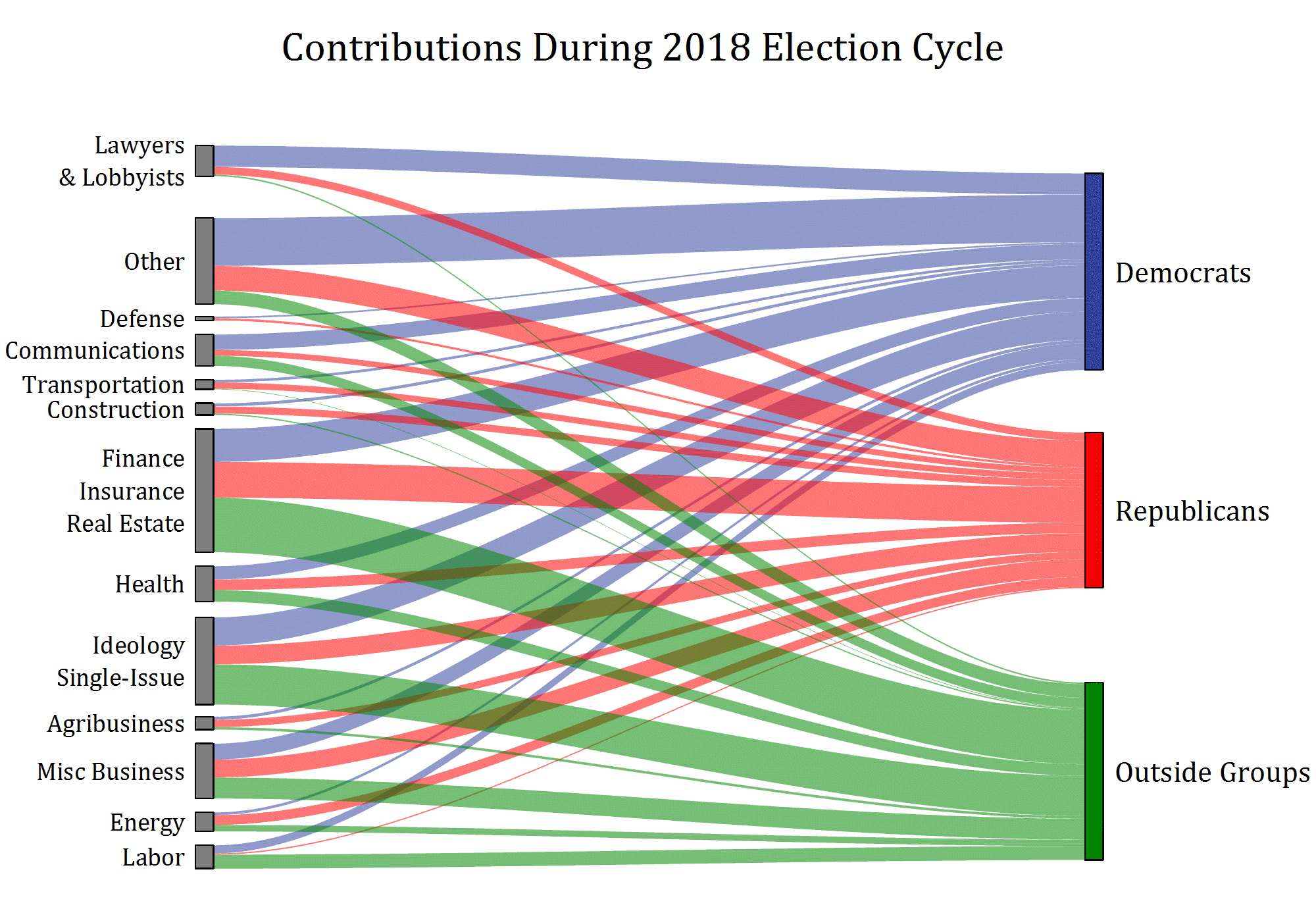
Sankey diagram of contributions from various groups during the 2018 election cycle.
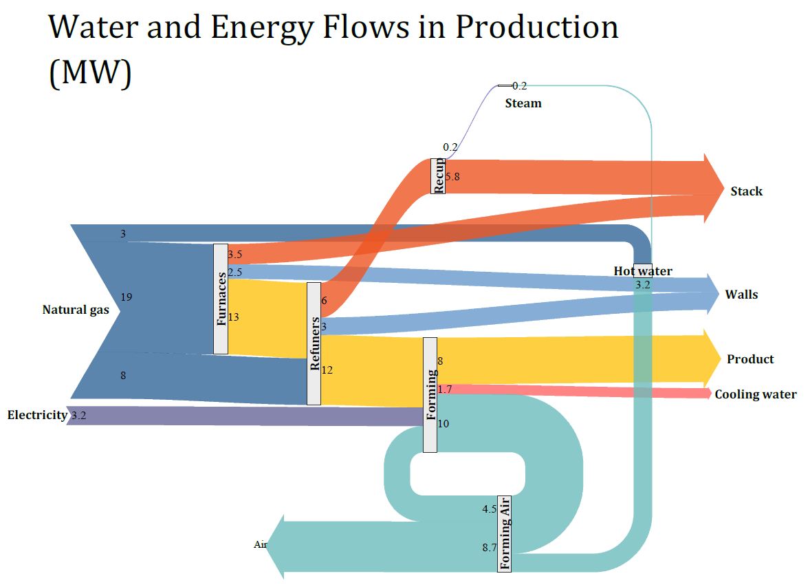
Sankey diagram showing flow of water and energy
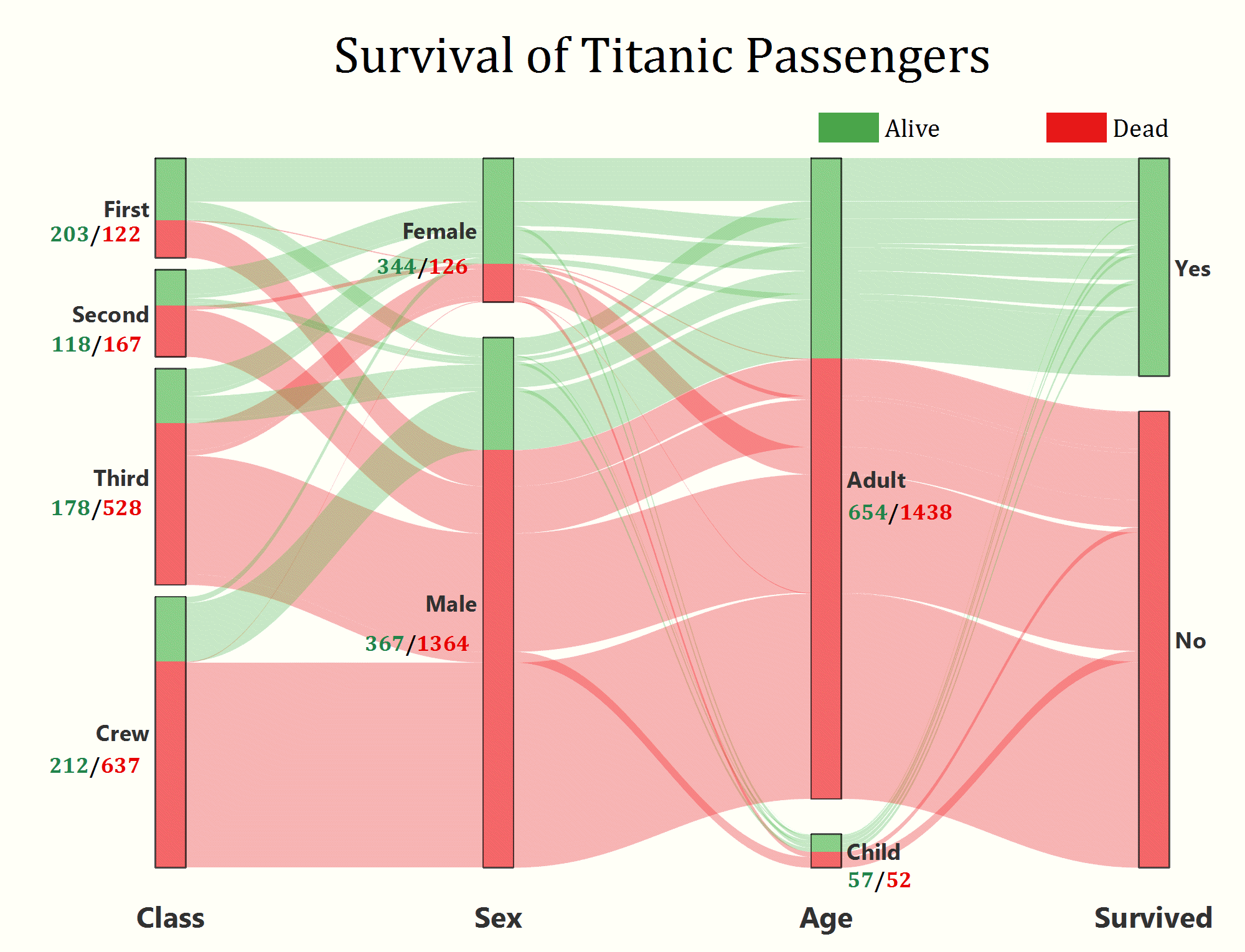
Alluvial diagram of Titanic survival data
Dendrograms
Dendrogram plots have been significantly enhanced in OriginPro and Origin 2020. A Circular Dendrogram plot has also been added.
Several Statistical tools and Apps for OriginPro have an option to create Dendrograms.
OriginPro further provides advanced customization of these plots, such as switching and swapping nodes, and extracting specific nodes to new graphs.
More information at the OriginLab Blog
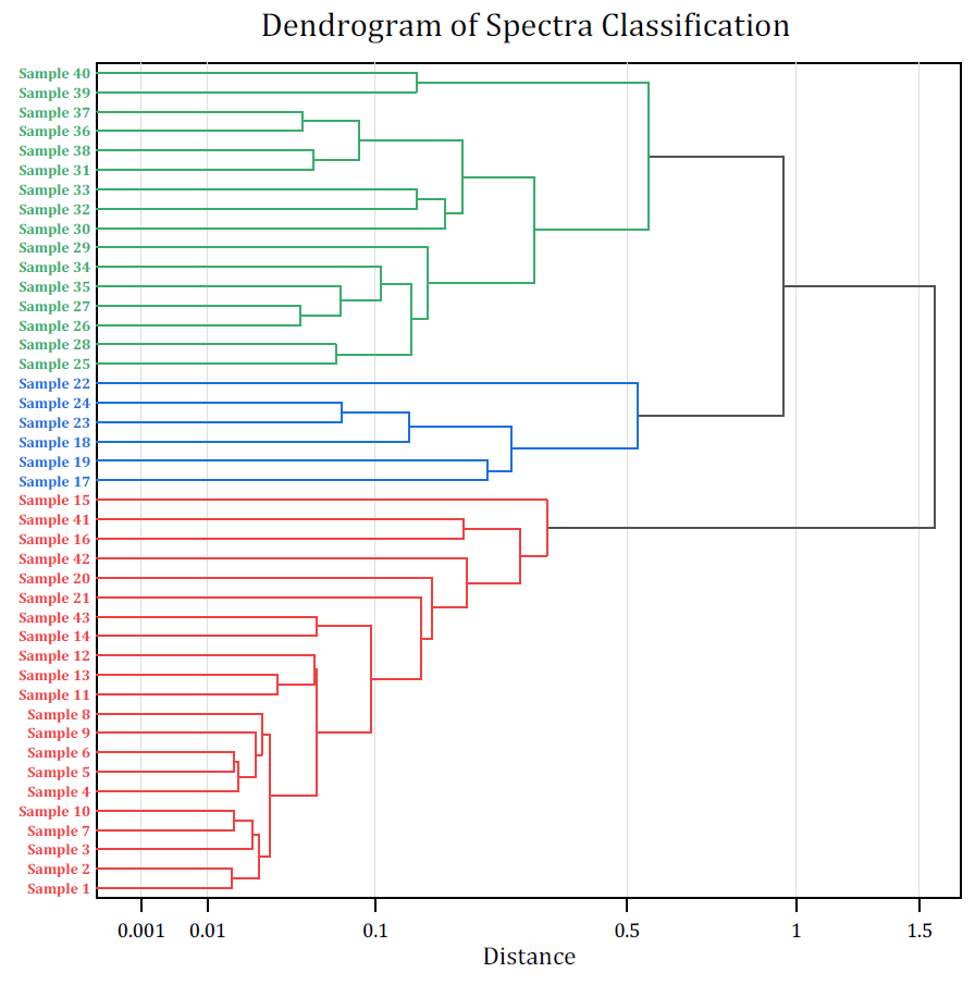
Dendrogram of spectra classification
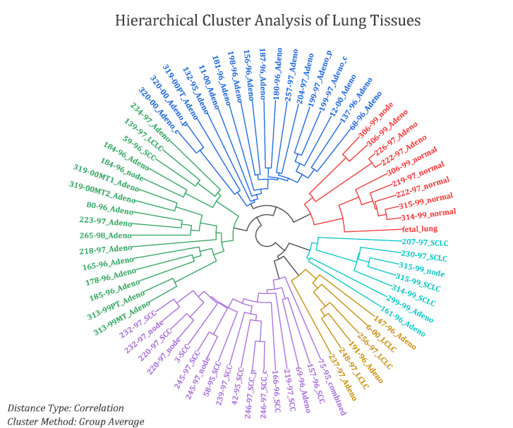
Circular Dendrogram from Hierarchical Cluster Analysis of lung tissues.
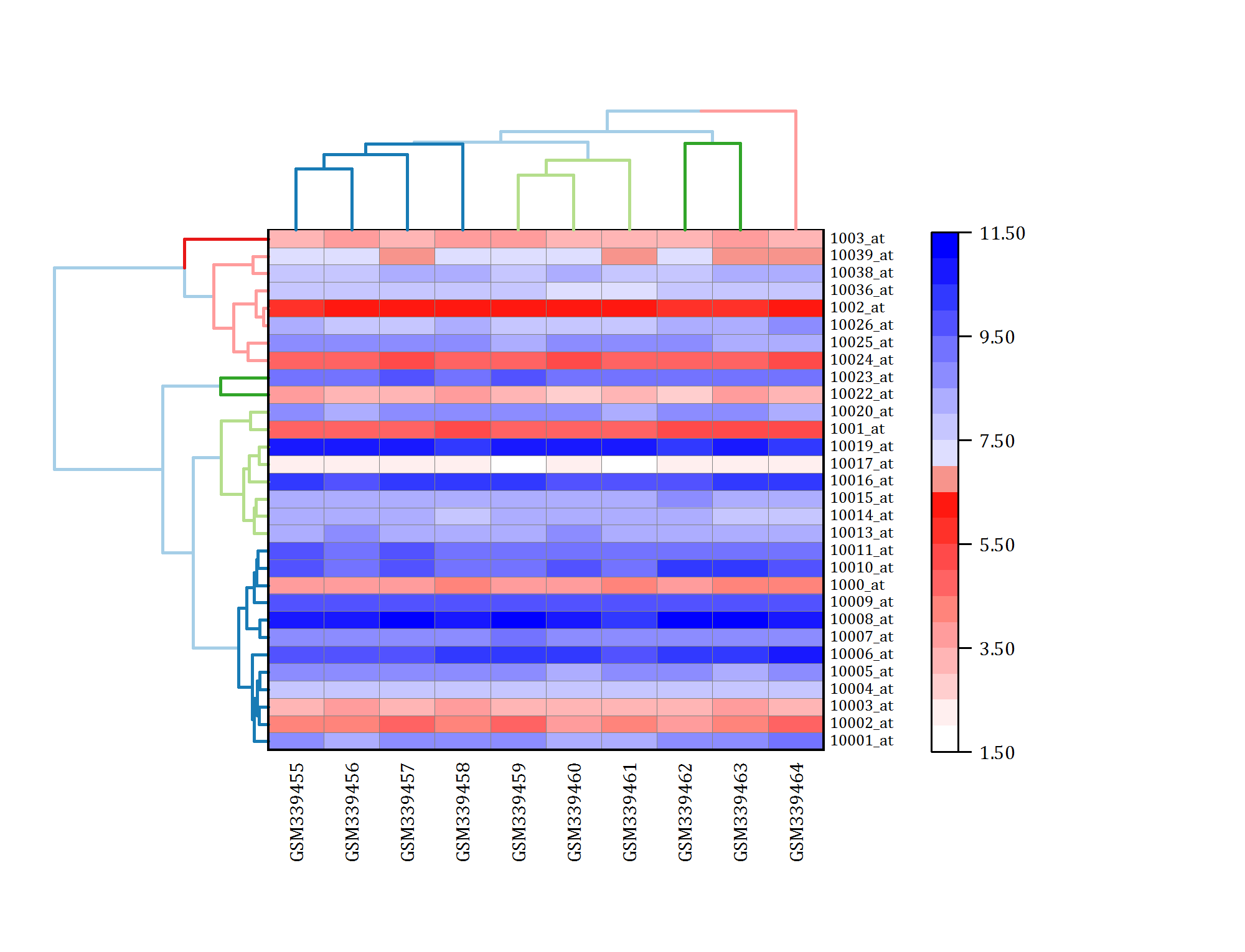
Heatmap with Dendrogram
Other New Graph Types
The following new graph types have also been added in OriginPro and Origin 2020:
- Color Dots
- Kite Diagram
More information at the OriginLab Blog - Population Pyramid
More information at the OriginLab Blog - Before-After Plot
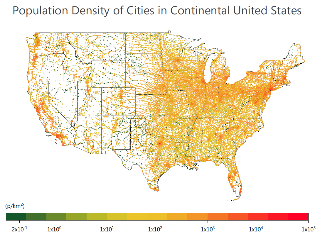
Population density of 37,000 US Cities plotted using the new *Color Dots* plot. The Import Shapefile App was used to overlay state boundaries.
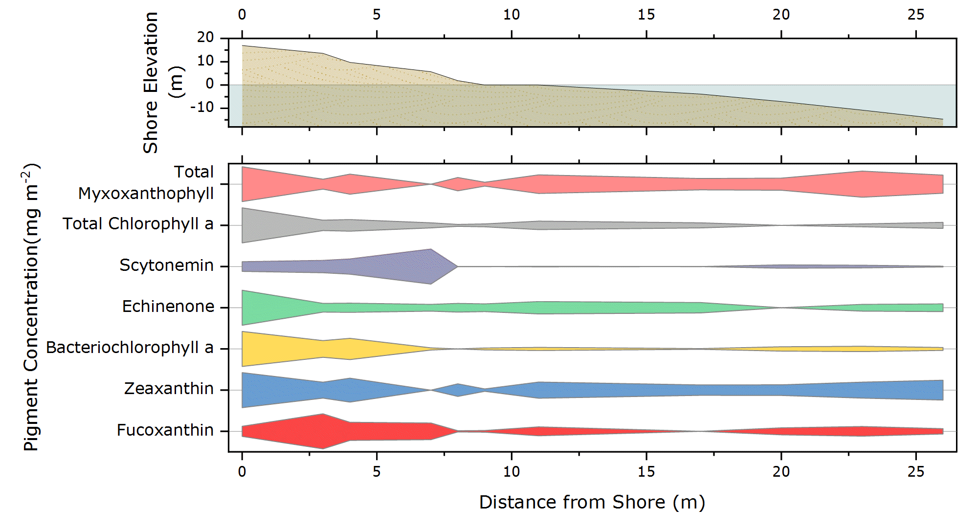
Kite Diagram with individual data normalized to 100. A shoreline profile has been added as a second layer on top of the Kite diagram
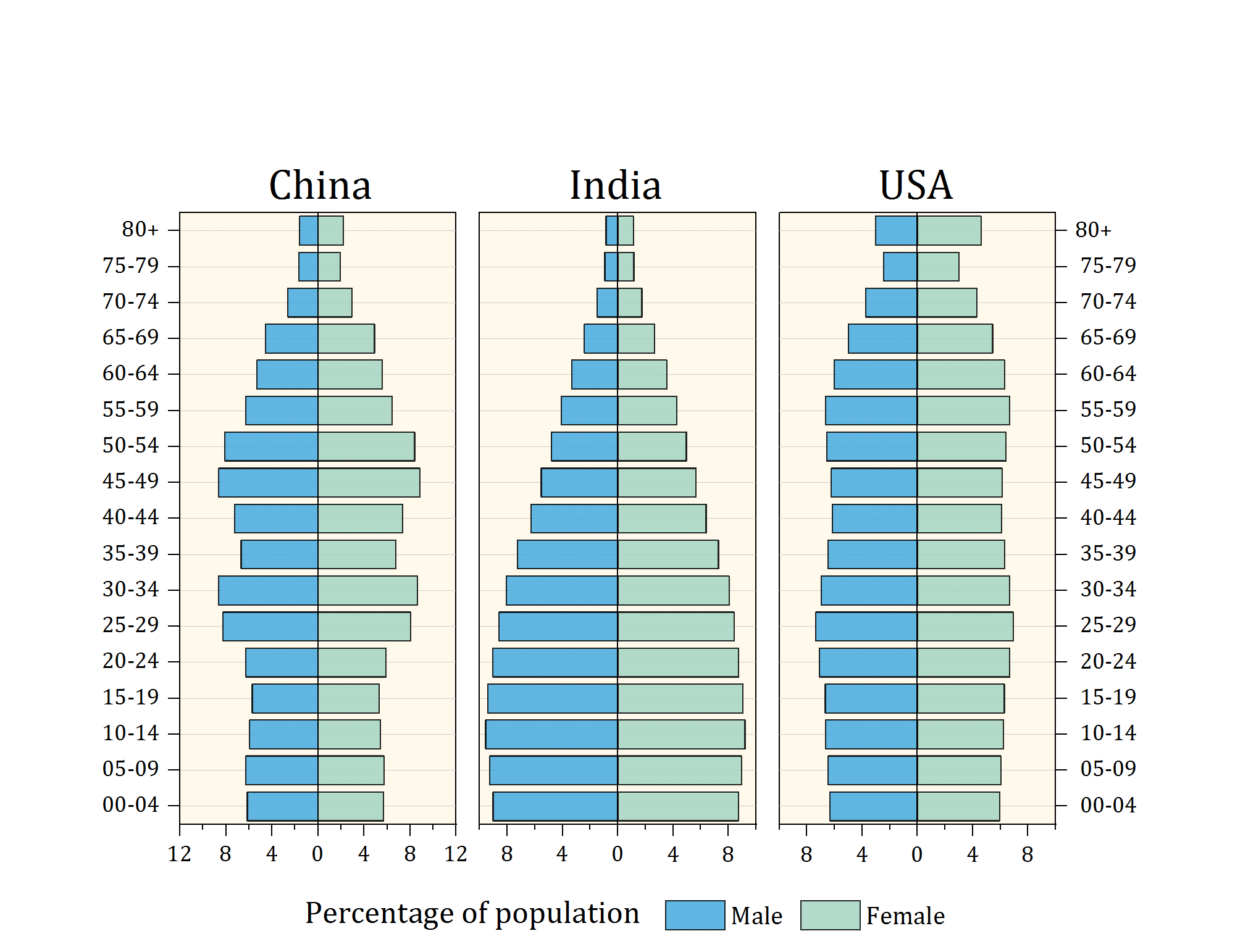
Population Pyramid
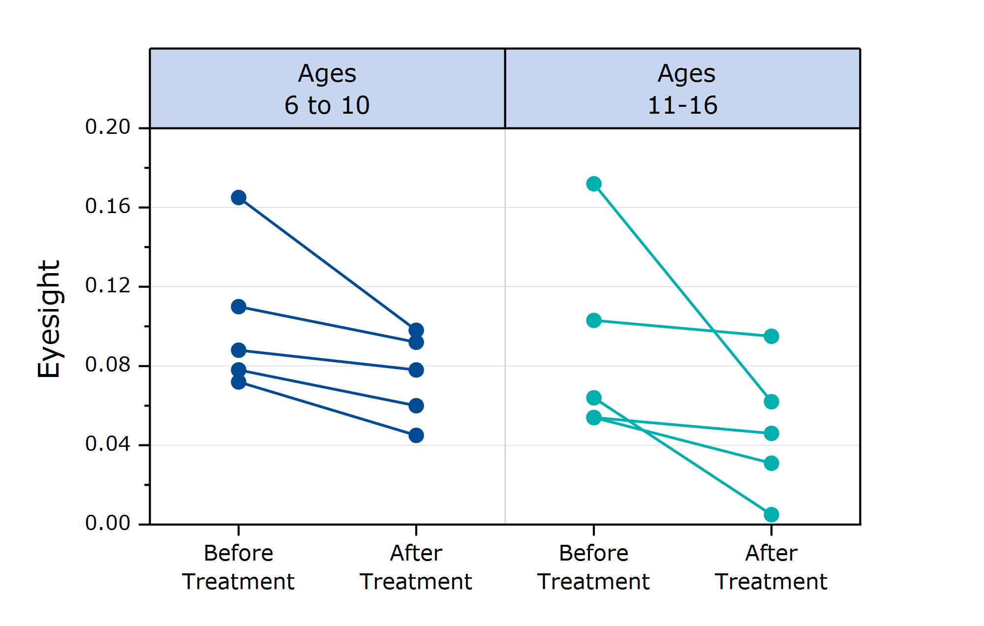
Before-After plot
Copy and Paste Data Plot
Copy and paste data plots from one graph layer to another in OriginPro and Origin 2020.
The data plot will be copied along with the custom formatting. The plot can even be pasted into a new layer as when adding a second Y axis.
Copy and Paste HTML or EMF Tables
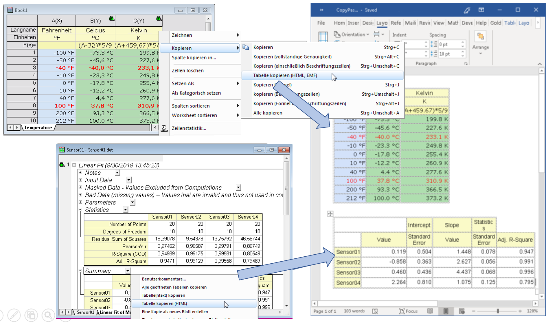
Copy worksheet cells or report tables as HTML/EMF and paste to other applications such as Microsoft Word.
Copy formatted worksheet cells or tables from OriginPro's and Origin's report sheets, as HTML. Then paste to other applications such as Microsoft Word and edit further. Worksheet cells can also be copied as EMF.
Copy worksheet cells or report tables as HTML/EMF and paste to other applications such as Microsoft Word.
Absolute Referencing in Cell Formula
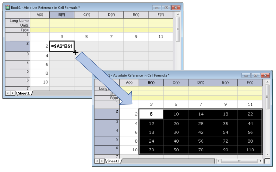
Use absolute reference for row and/or column. Then drag formula horizontally, vertically or diagonally.
Similar to Excel, you can now use the "$" syntax to create absolute references in Cell Formulas in OriginPro and Origin worksheets cells.
Absolute references can be used for row or column or both row and column.
Formulas can be extended horizontally, vertically or diagonally.
Use absolute reference for row and/or column. Then drag formula horizontally, vertically or diagonally.
New Apps
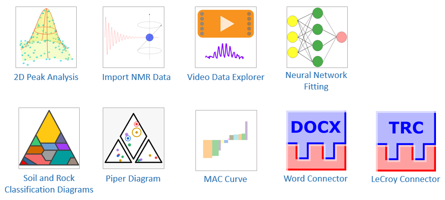
The following new Apps are available with the latest version of OriginPro and Origin. Several Data Connector Apps that are shipped with the product have also been improved and updated.
- 2D Peak Analysis ► OriginPro only
- Import NMR Data ►
- Video Data Explorer ► OriginPro only
- Neural Network Fitting ► OriginPro only
- Soil and Rock Classification Diagrams ►
- Piper Diagram ► OriginPro only
- Marginal Abatement Cost Curve ► OriginPro only
- Word Connector ►
- LeCroy Connector ►
Other Features
General
- SQL-like query to pull specific columns from an OriginPro/Origin Project using OriginPro/Origin Data Connector
- List View in Graph Template Library
- Object Manager for Workbooks and Worksheets
- User Tree at worksheet level for metadata
- CSV Connector: Preview checkbox, Partial import, Data Block marker
- Excel Connector: Specify Long Name, Units, Comments
- Drag-and-Drop support for Data Connectors
- Batch Analysis supports templates with Data Connector
- Database Import similar to Data Connectors: Data protection, clear data on saving project
- Copy subrange of data along with metadata in column labels
- Show column index and data size in Column List View
- Database import - ODBC speed improvement
Graph Customization
- Single-click to select data plot in a group, Shift + click to select group
- Offset data points in box chart and alternate the offset in pairs
- Separate rug-marks for each panel in Trellis plots
- Color Scale object improvements including show only Min and Max for labels at outside end; show subrange and tick label formula.
- Improved tooltip for Contour and Heatmap graphs
- New fast algorithm for Kernel Density plot
- Faster data highlight for large data
- Dense Data Mode on page level for faster redrawing
- Edit 3D data range or clip data by X,Y,Z values
- Compact control for font and line format in Plot Details dialog to make some tabs smaller
- More options in Windrose plot, such as uneven bin size, calm circle and paddle style spoke
Analysis
- Faster cell calculation and result sheet recalculation
- Duplicate book/sheet without data or clone project will keep cell formula and cell reference
- Copy all open tables from report sheets to paste to other applications
- Change Parameters... context menu anywhere in result sheet
- Sum function supports row-wise sum
- Normalize multiple columns by combining data
- Batch Processing: Generate a single Word or PDF report file when processing multiple data files
- Custom formula support in Simple Curve Math tool
- Context menu on analysis lock to include/exclude hidden rows in analysis
- Find Apps... menu under Fitting, Peak Analysis and Statistics menu
- NAG library upgraded to Mark 26.1 version
- LabTalk expression support in some X-Functions such as add straight line, etc.