Violin Plot in Origin 2019
Origin 2019 introduces the new Violin Plot graph type, which is a fancy variation of a box chart. It not only provides regular median, but also the kernel density curve of the observations to give you a better idea of whether there were clusters, etc.
The project file includes some samples and can be downloaded from the OriginLab website. OriginLab has also prepared a couple of different violin templates under plot menu for you as a good starter.
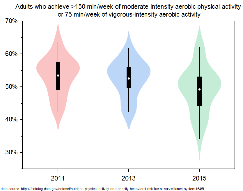
Below is a "standard" violin plot. It might not be obvious from the box, but from the distribution, we can see clearly that the mean center is dropping and the median is moving closer to it at the same time. |
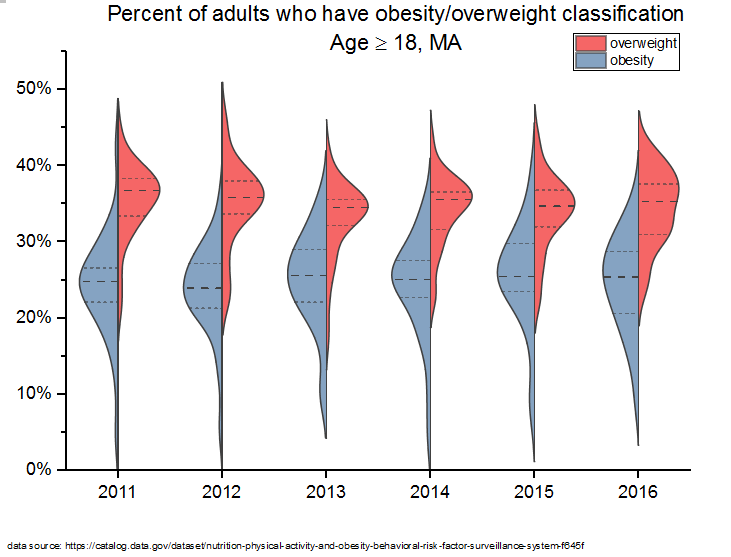
This is a split violin that demonstrates distributions that under two different subgroups. From the distribution curve, we can see that although the mean and std dev keeps similar across the years, the overweight percentage has a wider distribution. |
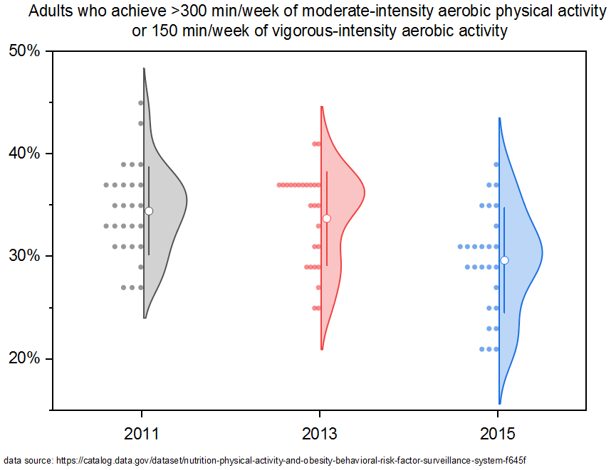
This is a half violin with each observation records displayed in bin. |
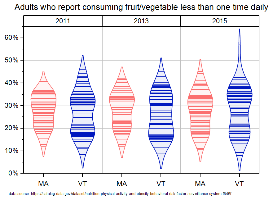
Here is another way to visualize the distributions, by plotting each observation as a line within the violin, which gives you an even more detailed demonstration of how the observations are laid out. |