


New in Origin/OriginPro 9.1
Please find an overview of the new key features of Origin on the following pages.
Graphing Features
Graphing Features
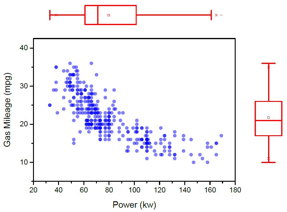
Grouped Box Chart and other Improvements
A lot of new controls on box plots have been added in Origin 9.1, and the new feature also allows box plots from indexed or raw data with grouping controls.
Grouped box chart with grouping information presented in tick label tables above and below the chart. |
Box width controlled by variable located in the worksheet header row |
Box position controlled by variable located in the worksheet header row |
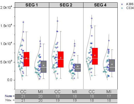
More information on Grouped Box Charts can be found at the Originlab website.
Piper/Trilinear Diagram
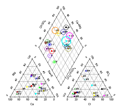
Piper diagram with point-by-point legend and option to adjust gap between the ternary and rhombus layers.
New in Origin 9.1 are piper diagrams which are typically used to plot water sample data.
More information on Piper/Trilinear Diagrams can be found at the Originlab website.
Grouped Column and Bar Plots
In Origin 9.1 you can create Grouped Column/Bar Plots or Grouped Stacked Column/Bar Plots and customize axes using tick label tables.
Grouped Column Plot with error bars, data labels and tick labels table |
Bar Plot with group support, showing tick labels table |
Grouped Stacked Column Plot with ticks labels table |
More information on Grouped Column and Bar Plots can be found at the Originlab website.
Improved Polar Plot
Several significant improvements have been made to Polar plots in Origin 9.1.
|
Polar plot with custom radial axis scale. |
Stacked column polar plot. |
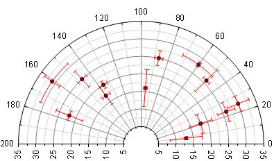
More information on the improved Polar Plot can be found at the Originlab website.
3D OpenGL Waterfall
3D OpenGL based Waterfall plot with controls to rotate, skew and shear the plot. The Y-axis can be displayed either on the front or the back plane.
An OpenGL-based 3D Waterfall plot type has been added.
More information on the OpenGL-based 3D Waterfall plot can be found at the Originlab website.
3D Ternary Surface
You can create a 3D Ternary plot in two quick steps - highlight your data and click a toolbar button. Your data is automatically normalized.
3D Ternary Surface plot with contour projection on bottom plane. |
3D Ternary scatter with drop lines. |
More information on 3D Ternary Surfaces can be found at the Originlab website.
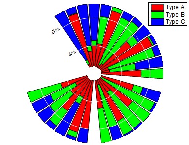
100% Column and Bar Plot
100% column with percentage labeling and connecting lines between bars. Automatic normalization to percentage without having to manually transform data. Special custom labeling format for percentages with the option to hide values below a given threshold.
The new 100% stacked column/bar plots in Origin 9.1 allow you to compare the contribution of each category as a percentage of the total.
More information on 100% Column and Bar Plots can be found at the Originlab website.
Sparklines
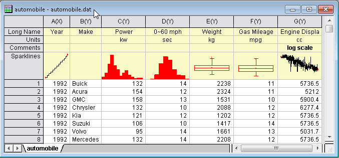
Worksheet with Line, Histogram and Box Chart as Sparklines.
In Origin 9.1 Sparklines have been added which can be set as histogram or box chart. Log scale for X and Y are also supported.
More information on Sparklines can be found at the Originlab website.
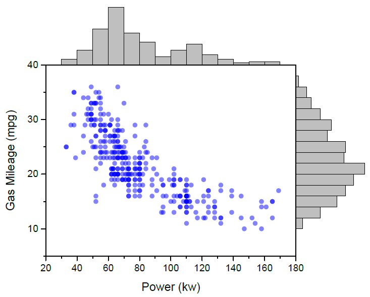
Marginal Histogram & Box Plot
The new feature for Marginal Histogram/Box Charts allows you to view the distribution of two variables along with their correlation.
Marginal Histogram |
Marginal Box Chart |
More information on Marginal Histogram & Box Plots can be found at the Originlab website.
Worksheet
Worksheet
Column Formula Label Row
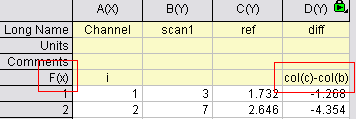
F(x) column label row showing formula. Formula can be entered or edited directly in cell, or defined in Set Values dialog box.
A new F(x) label row in the worksheet header supports display and (optionally) direct-editing of a column values formula.
More information on the Column Formula Label Row can be found at the Originlab website.
Analysis
Analysis
LOWESS and LOESS Smoothing
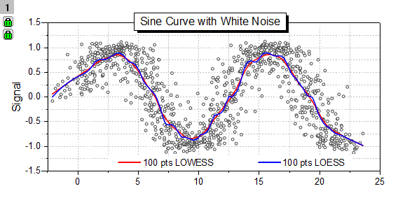
Lowess and Loess smoothed curves.
In Origin 9.1 Lowess and Loess smoothing options have been added to the Smoothing Tool. Loess and Lowess are methods to describes the deterministic part of the variation in the data without requirement of a specific function. They are especially useful for detecting the trend of the data.
More information on LOWESS and LOESS Smoothing can be found at the Originlab website.
Partial Least Squares Regression (Pro)
Partial Least Squares Regression
Partial Least Squares regression (PLS) has been added in Origin 9.1, which is used for constructing predictive models when there are many highly collinear factors.
More information on the Partial Least Squares Regression in OriginPro can be found at the Originlab website.
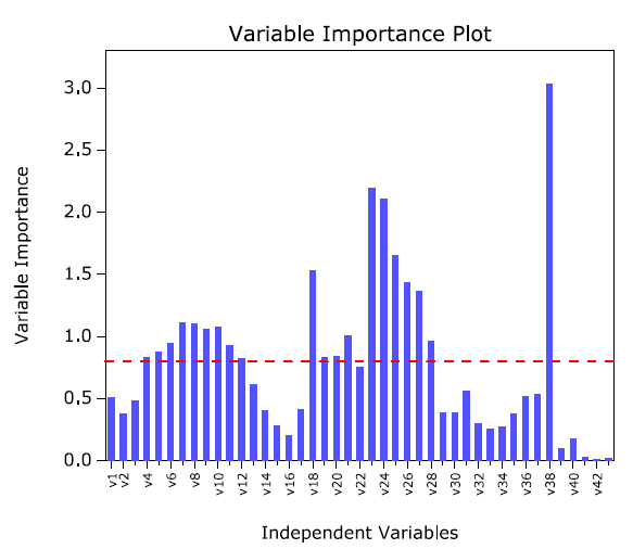
Rank Fitting Models (Pro)
![]()
Results of function comparison sorted by ascending BIC/AIC values.
The new Rank Models tool allows you to fit and rank multiple functions to one dataset to determine the best fitting function for your data.
More information on Rank Fitting Models can be found at the Originlab website.
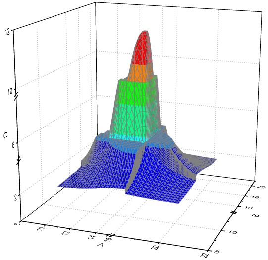
2D Integration Gadget (Pro)
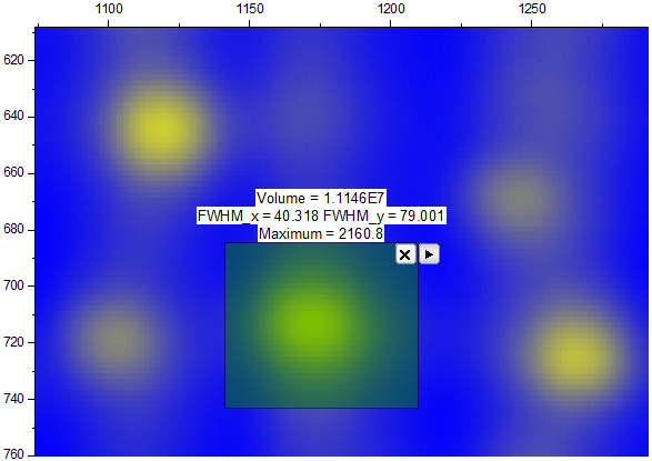
Results of 2D Integration on a color fill contour plot
A new adjustable region-of-interest (ROI) tool performs integration on an image plot or a contour plot produced from a matrix, virtual matrix or XYZ data.
More information on the 2D Integration Gadget can be found at the Originlab website.
Usability Improvements
Usability Improvements
Smart Labels - Auto Position of Data Labels
"Smart labeling" of data plots in Origin 9.1 supports auto-positioning of labels and leader lines.
Smart labeling of X values, located along a second X axis at Y-Axis end value. Auto re-positioning of labels with leader lines. |
Smart labeling of peaks in spectral data, with auto-generated leader lines from peaks to labels. |
More information on Smart Labels can be found at the Originlab website.
Copy & Paste Operation
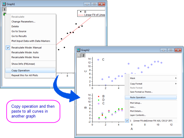
You can now copy the fit in one graph and then paste that to all curves in another graph. This allows all the settings to be applied, a big time saver.
More information on the copy & paste Operation can be found at the Originlab website.
Gadgets: Batch Analysis - Easily Apply Analysis to All Curves
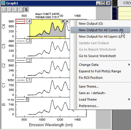
New menu items have been added to the fly-out menu in Gadgets to output results for all curves, thus allowing batch analysis of multiple curves in a graph using gadgets.
More information on the Batch Analysis using Gadgets can be found at the Originlab website.
Batch Plotting - Duplicate Graphs by Using Data from Different Sheets
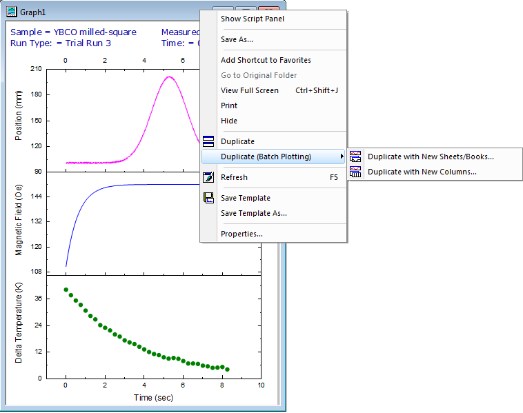
Right-click the graph window title and select the Batch Plotting method.
Origin 9.1 allows users to recreate a graph using a different sheet or book. Right-click on window title to see the new duplicate command.
More information on Batch Plotting can be found at the Originlab website.
Multiple Axis Breaks and Axis Break with No Gap
The axes dialog box has been completely redone to allow more features to be added in axes area, including
- Multiple Axis Breaks on X Y or Z axes
- User Defined Axis Scale Type is now supported
- You can now have more then one special tick to be added
Axis breaks on X, Y and Z scales in OpenGL 3D plot. |
Multiple breaks on a single graph axis (3 breaks pictured). |
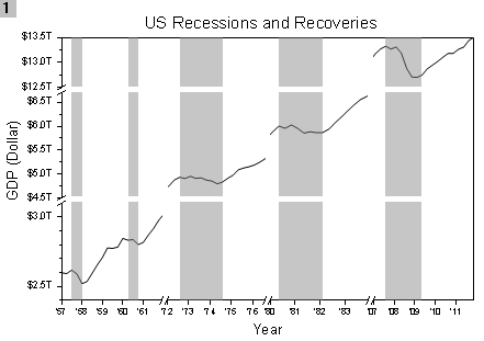
More information on Multiple Axis Breaks and Axis Break with No Gap can be found at the Originlab website.
Custom Axis Scale Type
Sqrt(X) axis scale type.
In Origin 9.1 you can create a custom axis scale by defining a formula and its inverse.
More information on Custom Axis Scale Types can be found at the Originlab website.
Custom Increment Lists
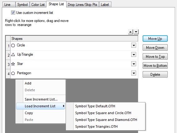
Load built-in or user-defined incrementing lists in Plot Details and apply them to your graph.
In Origin 9.1 you can build lists for custom incrementing of color, shape and interior fill for plot symbols and save these lists for future use.
More information on Custom Increment Lists can be found at the Originlab website.
Special Ticks and Labels
In Origin 9.1 several options for customizing tick positions and labels have been added.
X Axis showing four user-defined tick positions and labels in addition to a regularly-spaced date scale. |
Customized Minor tick labels on Y-axis log scale. Left Axis has minor labels at specified indices only. Right axis has minor ticks from a dataset. |
More information on Special Ticks and Labels can be found at the Originlab website.