
")


Plotting Horizontally Arranged Data Using Row-Wise Plotting in Origin 2019
Introduction
When plotting XY type data, Origin typically expects that the X and Y datasets be in columnar form. Multiple Y datasets with a shared X column would, of course, occupy multiple Y columns.
But sometimes there are users whose XY data is horizontally arranged where the X dataset occupies one row and the Y dataset occupies another. Given a shared X dataset, multiple Y datasets would occupy multiple rows. Such data can be referred to as row-wise data. For example:
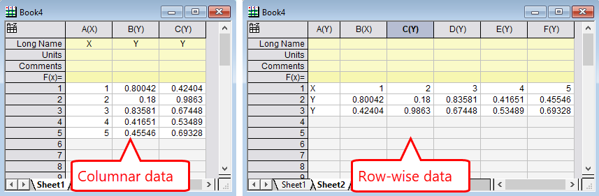
A simple example of the same XYY datasets presented in columnar format versus row-wise format
Starting with Origin 2019, Origin is able to plot this row-wise data without first converting it to columnar data. It is called Row-wise Plotting and it is available from the Plot menu.
Example
Hereafter comes an example of creating a Row-wise Plot from row-wise data.
If you wish to follow along or view the finished example (and other examples) for yourself, you can download the Origin Project from the OriginLab website. In the project, each graph associated with the relevant workbook is embedded into a worksheet entitled "Graph". Double-click on the embedded graph to activate it. You can also click on the green lock icon and select Change Parameters… to see the settings used to create the graph.
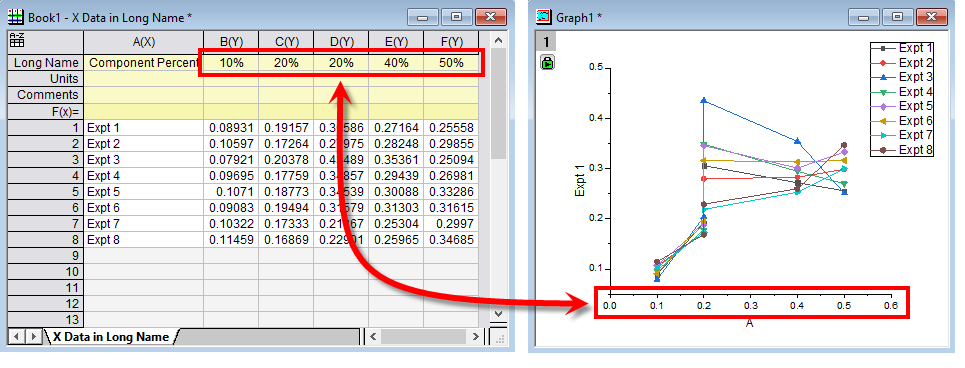
The row-wise data in this example contains an X dataset that represents numeric percentages in the Long Name label row and looks like:
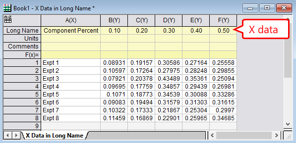
Example 1: Row-wise data with X dataset in Long Name label row.
To create a Row-wise Plot from this data:
- Select the rows of data.
- From the Plot menu, click on the Row-wise… icon.
- In the Row-wise Plot: plot_rowwise dialog, set:
- Y Label In: A(X) : Component Percent
- X Data in: Column Label
- Column Label: Long Name
- Plot Type: Line + Symbol
- Unless Auto Preview is checked, click the Preview button to see a preview of the graph.
- Click OK to generate the graph.
Note: You may observe a new worksheet has been added to the workbook. This sheet is automatically generated during the processing of creating the graph.
This animated GIF illustrates the process:
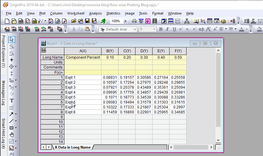
Illustration of the steps in Example 1.
The generated graph looks like this:
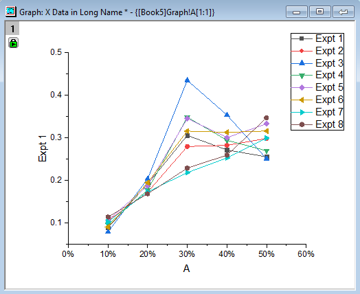
Example 1: Generated Row-wise Plot graph.
You will observe that the X axis tick labels have been converted to percent labels. This is possible because Origin recognizes that the X data in the Long Name row is numeric. In the Axis Dialog, the Tick Labels: Display is set to Custom and Custom Format set to #%.
A Note about format of X data
Origin 2019 is smart about handling of non purely numeric data in column labels rows. It can handle data time values and, as illustrated below, Origin is able to extract the numeric part of the percent value and set plot labels to the numeric values:
More Options for X Data
There are more options in the X Data in dropdown control in the dialog for specifying the location of the X dataset:
- First row in Row-wise Data: When selecting rows to plot, use the first selected row for the X dataset.
- First row in sheet: Use the very first row in the worksheet for the X dataset.
- Custom: Use the Hunt button to select an arbitrary row for the X dataset.
Row-wise Y Errors
Row-wise Plots also support Y errors and will automatically include the error bars when generating the graph. Simply structure your Y and Y Error datasets as illustrated below:
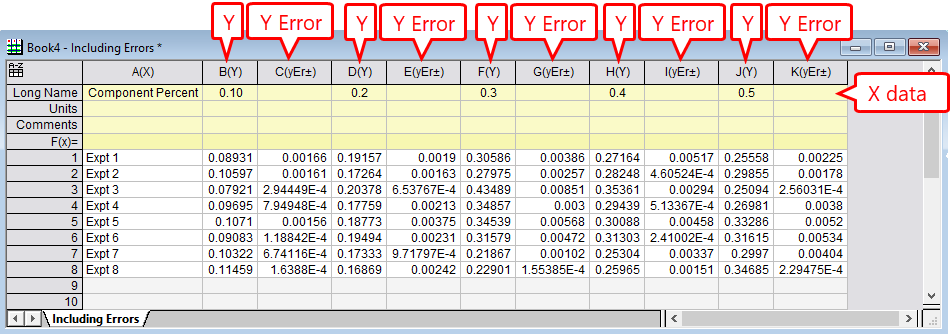
Illustration of Y and Y Error dataset structure for Row-wise Plotting data.
Adding More Data Later?
If you think you will be adding more rows of data at a later time, a good hint is to over-select the rows when creating the plot. For example, if you select an additional 5 empty rows after the data ends, you will be able to add up to five more rows later and they will use automatically incorporated into the plot graph.