
")


Automating Chart Production reduces time required to produce quartertyl Portfolio Reports
Templeton Global Investors, Inc.
Templeton Global Investors, Inc. dramatically reduced the amount of time required to produce quarterly portfolio reports by automating chart production. The "Over/Under" chart is one of the most popular charts used by Templeton to keep clients informed of portfolio structure. This graph was created in an effort to compare portfolio investments to major investment indexes. The format utilized by Templeton features two horizontal bar charts placed in parallel on a single piece of paper arranged in landscape orientation. The company previously produced their "over/under" charts using another software package, however the large number of countries required a reduction of label size. This situation resulted in a graph that was illegible and unattractive.
After examining a range of graphics packages, Templeton performance analysts discovered that Origin software offered the optimal solution. Origin provides the required level of control over every graphing element. This feature is absolutely required in the production of professional quality charts. Origin additionally utilizes a complete programming language, therefore, Templeton enlisted the software manufacturer, OriginLab Corp., to produce a batch processing routine that automatically completes every chart needed by the company each quarter.
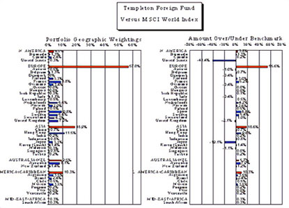
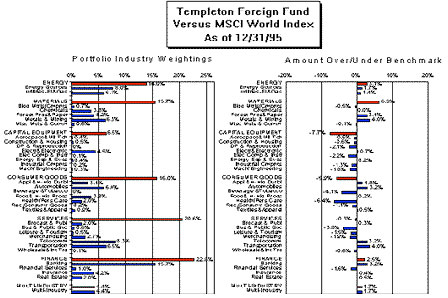
Templeton Global Investors, Inc. is a subsidiary of Franklin Resources, Inc., a diversified financial services holding company which, through its various operating subsidiaries, has $180.9 billion under management as of December 1996 in the Franklin Templeton Group. In 1954, Templeton introduced the Templeton Growth Fund, one of the first global equity funds, which maintains $10.0 billion assets under management as of December 1996. In 1992, Templeton combined with Franklin, which focused primarily on fixed-income and domestic equity investments. The resulting combination provides a comprehensive selection of investment opportunities rarely duplicated by mutual fund organizations. In addition to mutual funds, Templeton provides private accounts for institutional investors. These dual services require massive reporting with an emphasis on conveying complex data in a simple manner. The over/under chart is one means by which Templeton keeps its clients informed of its investment strategy. Templeton created the over/under chart in an effort to compare its investments to major investment indexes in a clear, straightforward manner. The two types of over/under charts report on industry weights and geographic weights of a portfolio as compared to a major index.
The format used by Templeton has two horizontal bar charts placed side by side on a single legal sized paper arranged in landscape orientation. For a geographic weighting over/under chart (see below), the left-hand chart represents all of the countries in the portfolio and the benchmark on the y axis. The countries are organized according to geographical regions. The bars corresponding to each country display the percentage of the fund invested in each country. The chart on the right-hand side of the page has an identical listing of countries on the yaxis. The x-axis indicates the difference between the fund's investment in each country and the index to which the fund is being compared.
An industry weighting over/under chart (see below) is similar to the geographic weighting chart, however, the chart displays different industries organized into sectors of the economy on the yaxis. Before this development, multiple charts were produced every quarter with a commonly-used spreadsheet, and this software package automatically sets the label size based on the number of rows in the chart. As Templeton funds expanded into new geographic areas and industries, the number of rows increased to the point that the labels became illegible, so the graphs became ineffective.
Templeton analysts examined a considerable number of other programs but experienced difficulty finding software that would solve this problem while still allowing the production of the charts to be fully automated. For example, one package provided the necessary flexibility in adjusting label size but did not permit an automatic production of the charts.This program had no macro facility. It could be controlled through another application's macro by accepting keystrokes via DDE. However, the only way to switch from one chart to the other was with a mouse.There is no way to switch between the charts using keystrokes. Consequently, an acceptable chart could be created manually but the process could not be automated.
The analysts finally discovered Origin Version 4.0 which is a Windows-based technical graphics and data analysis software package from OriginLab Corp., located in Northampton, Massachusetts. This software package provides two crucial advantages that makes it ideally suited for this application. Origin contains a wide range of graphing flexibility, thus allowing the user to adjust virtually any parameter of the graph simply by clicking on it with a mouse and adjusting the necessary parameters by either clicking and dragging with the mouse or filling in a dialog box. Second, Origin utilizes an extremely powerful programming language, called LabTalk™ that provides access to virtually every function in the program.
Templeton performance analysts quickly verified that the software package made it possible to adjust label size and provide a legible, attractive chart. They then considered the task of automating the preparation of the charts.The analysts believed they could eventually produce a macro that would automate chart production. However, when considering time constraints, they decided to contract with the software developer to develop a macro that would produce the entire quarter's supply of over/under charts in a single run.
Prior to executing this macro, the user enters some basic information into a spreadsheet-like input form. This information includes the portfolio type that determines which of two different formats of tab delimited ASCII data files the portfolio information will be stored in. The user also enters the file name where the portfolio data is stored, the name of the index to be used and the number of copies to be printed. The user has the option of checking a box which will direct the macro to print to a PDF file for viewing with Adobe Acrobat on a wide range of platforms. Then the macro is executed.
It imports the portfolio file, checks its date and imports the proper index file with the same date. If an index file with the right date cannot be found, an error message is automatically generated.The macro reads each investment from the portfolio and index files and calculates the total amount invested in each country and geographic region. The region for each country and the sector for each industry is obtained from a table. The amount invested in each region and sector is calculated by summing the percentages for each country and industry. If the country or industry is not contained in the lookup table, the program halts and asks the user to add the country to that table. The sector of each industry is retrieved in a similar manner.